This is part two in a website redesign. Click here to read about phase one: content strategy and information architecture.
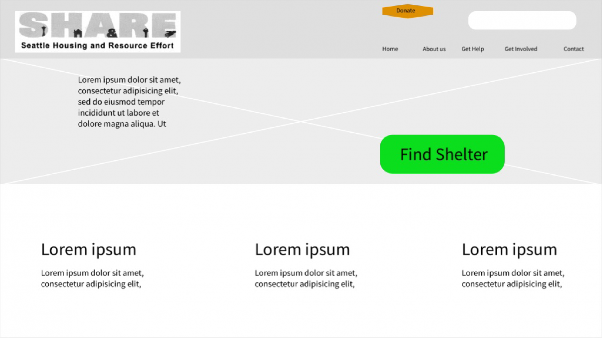
Here are some very rough wireframes of the new design (the new text and headings have not been added yet):
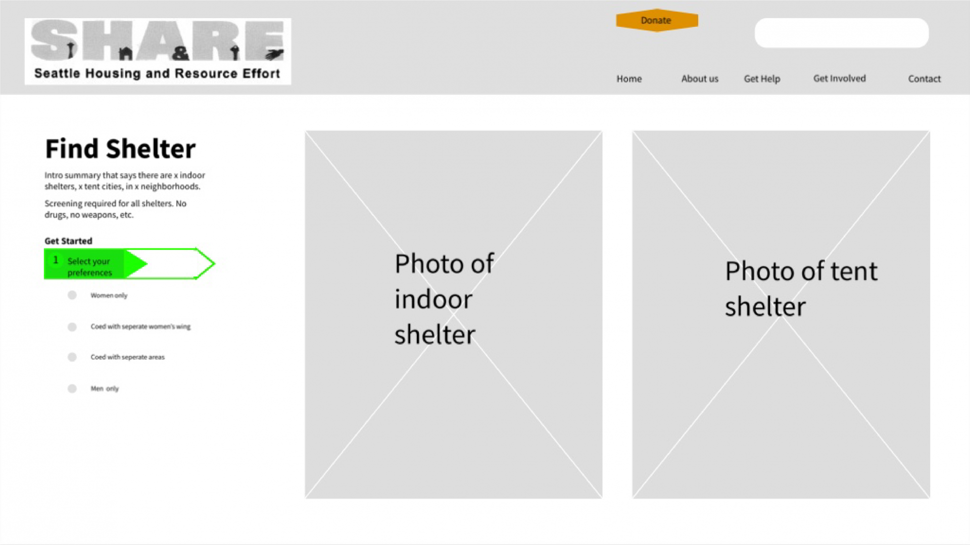
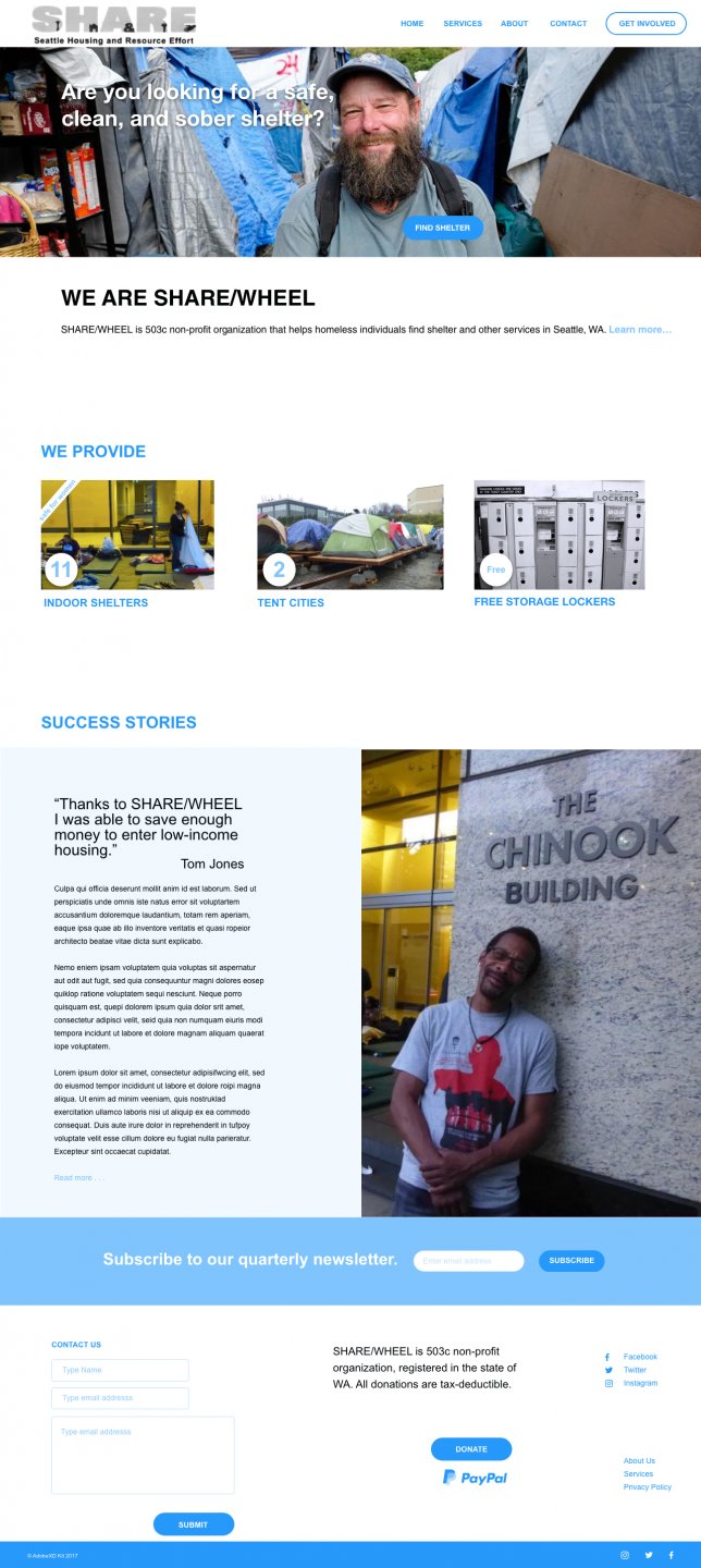
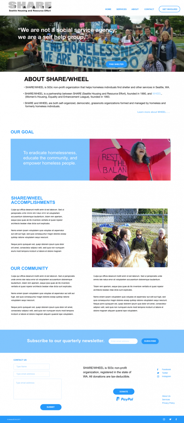
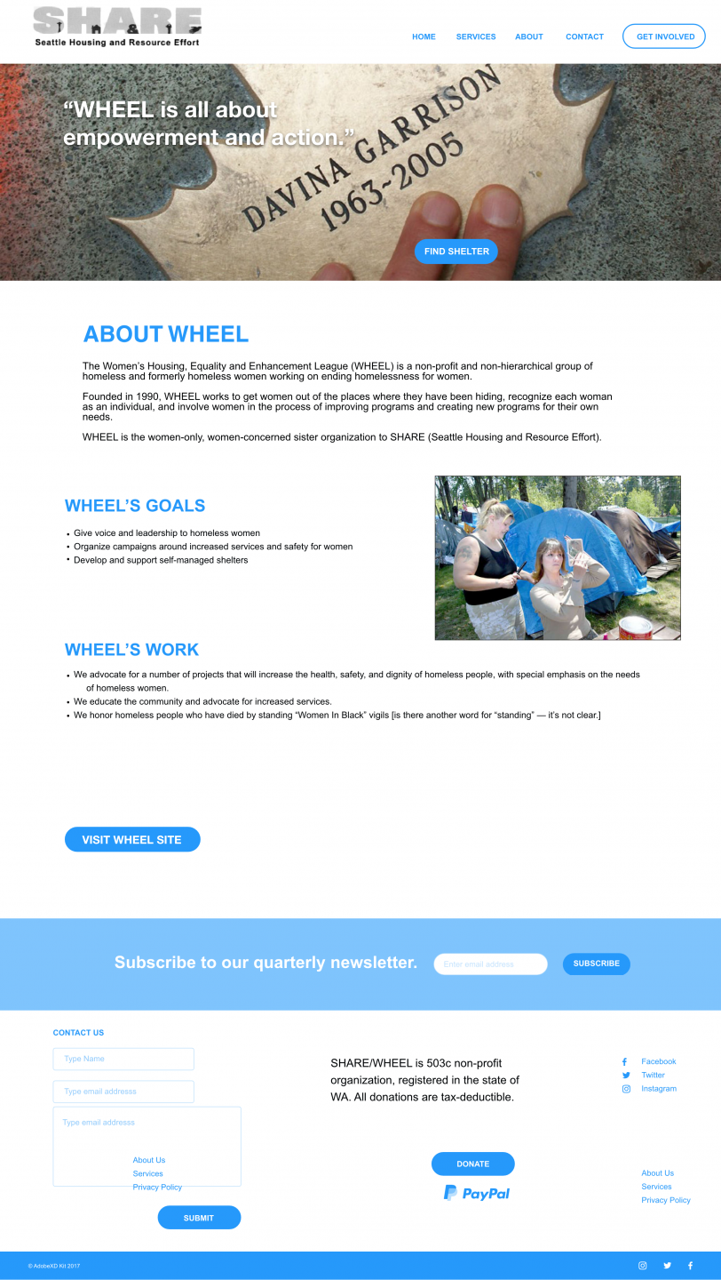
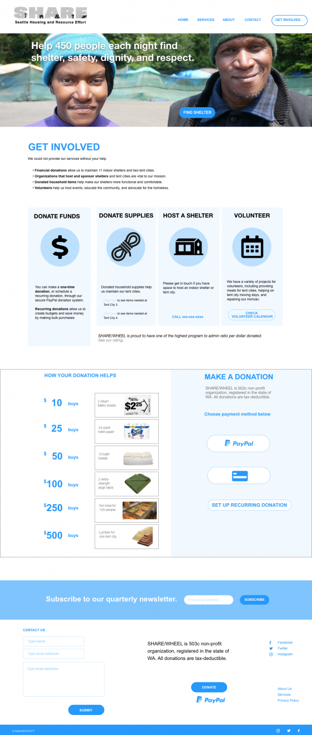
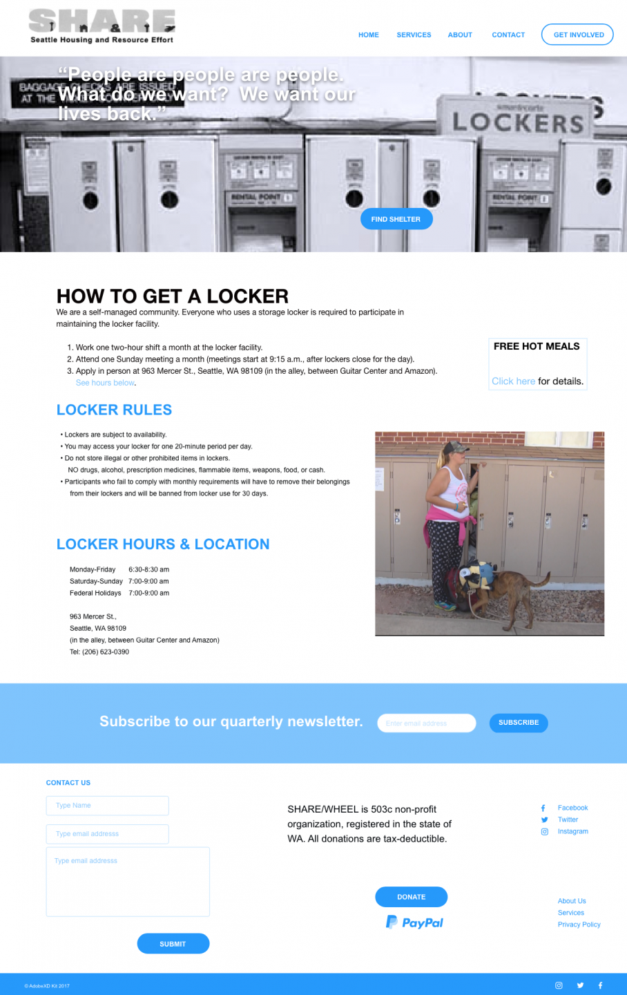
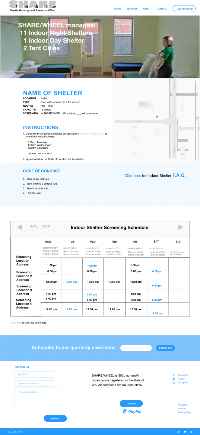
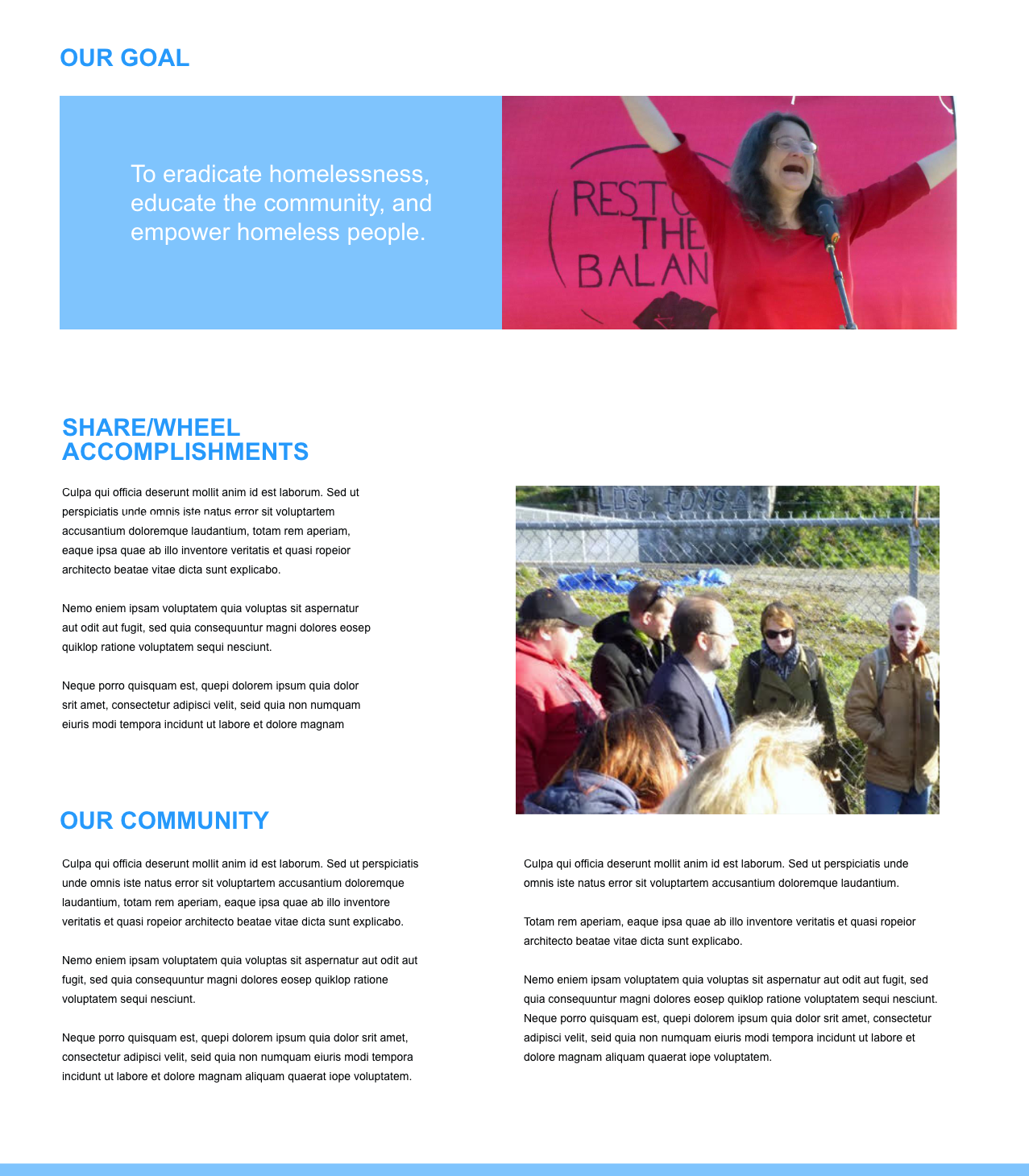
Here are some prototypes. The client still needed a lot of information to be on the site, but I have used hierarchy to organize content and images to create a feeling of community. (Some images are from the client, some are pulled from the web just for placement.) I’ll put this into Invision soon.
